APPLICATION REDESIGN

The complete app redesign and insights & on-boarding improvement project

PROJECT BRIEF
For this project, our primary goal, as outlined by our stakeholder Yuri, was to redefine the onboarding process to ensure clarity, enhance new user retention, and clearly showcase the app's unique proposition. We were also tasked with improving chat insights, making them more intuitive, engaging, and enjoyable for users. Finally, we took the initiative to address the app's overall branding to establish a meaningful and consistent connection with Spilk users.
TIMEFRAME
2 weeks
MY ROLE
UX + UI Design, Branding, Research, Prototyping + Testing with Anna Permyakova & Nargiz Safaraliyeva
TOOLS
Figma, Figjam, Slack, Notion, Photoshop, Google forms, Email, AI, Ilustrator
WHAT IS SPILK?
Spilk is a phone application that uses AI in order to analyse your chats and extract relevant and interesting insights such as: who texted more, who ghosted more, etc.
STAKEHOLDER INTERVIEW
Our stakeholder interview highlighted several key points: new users aren't grasping the app's value during onboarding, while the "Wrapped" chat stories are a highly engaging and viral feature. Although privacy is technically robust, users don't perceive it due to a lack of clear explanation. The current branding is flexible but needs further definition, and all efforts should be tailored to our primary audience: young users under 30, particularly in LATAM and Spain.
USER INTERVIEWS
Users need clear and smooth onboarding process, with privacy clearly explained.
They want to ultimately improve their understanding of their texting patterns and improve them.
They’re drawn to playful, yet insightful, easy-to-engage chat stats that will help them understand and improve communication.
And there is a need for a brand identity they could connect with emotionally.
USER PERSONA
To truly connect with our audience, we crafted two distinct user personas: Alejandro and Daniela. While their app journey is similar, their core motivations diverge. Alejandro seeks a fun, interactive tool to deepen friendships, while Daniela looks for meaningful insights into her romantic conversations. Our design thoughtfully respects both these drives, ensuring a more engaging and insightful experience for everyone.

Alejandro is an energetic, outgoing guy, with a rich social life. He is often on the go and doesn’t always have time to respond to his chats.
Goals:
-
Have fun, spend time with friends and travel more
-
Connect with people and share fun moments
Pain points:
-
Missing the sharing function in the app
-
Statistics graphs look too boring and un engaging

Daniela is a sensitive Gen Z student from Portugal. She just recently started dating and its not sure of certain personality types when it comes to texting.
Goals:
-
Gain insight into relationship dynamics
-
Ability to reflect meaningfully on communication habits
Pain points:
-
Concern about data misuse or privacy breaches
-
Overwhelmed by scrolling through endless conversations
PROBLEM STATEMENT
Gen Z individuals need a way toclearly identify emotional patterns in chat data to better understand and improve communication with important people in their lives.
IDEATION
Digital Distractions Harm Focus and Productivity
Onboarding:
-
Simplifying the process, by eliminating the chat upload instructions, and decreasing user overwhelm.
-
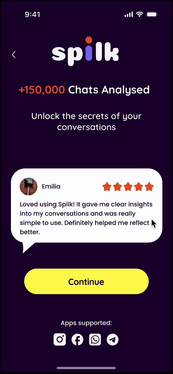
Creating trust with Testimonials and clear information.
-
And building a demo to show the unique value proposition of the app.
For our ideation part, we split the project into 3 parts:
Insights:
-
Organize information clearly in bento-box style sections.
-
Make the graphs reflect the data in an engaging and logical way.
Branding:
-
Creating a consistent brand identity that reflects the product spirit and creates an emotional bond with the user.
MIDFI WIREFRAMES
Digital Distractions Harm Focus and Productivity
All the insights gathered and our design thinking process led us to develop mid-fidelity wireframes that reflected the key outcomes of our ideation phase.
As a team, we spent considerable time refining the structure and crafting a prototype that would be easy to navigate during usability testing. This prototype was shaped by everything we learned through research, user feedback, and identified needs. Based on the insights and test results, we divided the work thoughtfully, aligning on a clear plan of action through collaborative discussion.

USABILITY & CONCEPT TESTING
We needed to understand how real users experienced the product — did it guide them effortlessly or create friction? The answer: a bit of both. That insight set the direction for everything that came next.
Results? Early feedback showed improved task flow comprehension and fewer user drop-offs. This meant one thing commercially: a stickier, more trustworthy product — one that better supports growth and user loyalty.
RESULTS
Onboarding:
Positive: Users loved the clear, professional feel.
Areas for improvement:
-
Confusing Multi-select options.
-
"Import Chat" button placement.
In-App Stats:
Positive: Great clarity and engagement.
Areas for improvement:
-
Clearer section separation.
-
Data-to-number connection.
Wrapped Stories:
Positive: Loved engagement and visuals.
Areas for improvement:
-
Discoverability issues.
-
Lacked a clear "return".
General:
Users felt a "total difference," finding the new version "more intuitive" and "engaging." This signals strong positive progress.
BRANDING
Micro-interactions
App starting screen


Now for the very exciting part of what is Branding, when it came to rebranding the app, we got inspired from the current Spilk Logo with the two dots on the top.
We wanted to emphasize the circles and reuse them to showcase the main pillars of the app: the user, the chats they’re analyzing and the insights they get from the app.

As next steps, we explored the branding further. To make the brand look cohesive, we chose the typography and icons with rounded ends, to support the feeling of softness and trust, but also to highlight the connection to the shapes established in the brands core identity.
For the color palette, we chose a dark theme as the foundation to evoke a sense of intimacy and personalization. Vibrant accent colors were used to highlight data and insights, enhancing engagement and visual clarity. We intentionally selected colors that feel inclusive, energetic, youthful, and fun.

We also created micro interactions for loading screens and when new users open the app and start with their on-boarding process, all crafted in a spirit of the new branding and UI, and with the goal to keep users informed, engaged and trusting in the tool.
Demo screens
Reviews screen
Loading screen

INSIGHTS COMPONENTS
We designed a set of charts inline with our new branding for the main overview insights page and for all the single pages with details about the chat metrics. Our focus was clarity, engagement and brand consistency.
Landing page insights

Main dashboard insights
WELCOME TO SPILK
FROM CLUTTERED TO CLEAR: THE REDESIGNED DASHBOARD FOCUSES ON WHAT MATTERS
CLICK ON THE
PROTOTYPE
TO INTERACT WITH
THE NEW DESIGN
PROTOTYPE TESTING
We asked our target audience for the desirability testing and received a very positive reaction. Some of the comments mentioned an emotional connection to the app and very clear data visualization.
“Love the dark background in the onboarding, it puts me in the mood”
“Awesome dashboard design and love that, now each insight has its own graph, its super clear and visual”
“The new look has an emotional connection, I want to come back to the app and explore more"
FINAL THOUGHTS
This project wasn’t just about cleaning up a UI — it was about redefining how users experience insight. By stripping away the noise and prioritizing clarity, we aligned the design with user behavior and product goals.
The result? A smarter, more human interface that builds trust, improves usability, and reinforces Spilk’s position in a competitive space.
Design has the power to shape perception — and in this case, it helped transform a tool into a partner in decision-making.
